
Try the #1 software for $1/month.
Norem ipsum dolor sit amet, consectetur adipiscing elit. Etiam eu turpis molestie, dictum est a, mattis tellus. Sed dignissim, metus nec accumsan.
Tips

It’s never a bad time to refresh your gym website, which means today is the perfect day to start building a conversion-optimized, SEO-friendly website with Wodify.
In this guide, I’ve rounded up several noteworthy examples of gym websites from the perspectives of design, content, and user experience. If you’re looking for inspiration for your own site or for helping a friend with their gym website, these examples are great to add to your notes.
As you begin planning your new gym website, there’s no better place to start than by looking at other well-designed websites. In this article, we’ll showcase real-world gym website examples to inspire your design and strategy. From navigation to creative inspiration, it’s a great foundation for what will eventually be the face of your business online.
A great fitness website doesn’t just look good—it creates a strong first impression that matters for your gym’s online presence. It reflects your brand, shows off your customer community, and converts visitors into members.
The impression your website creates can directly influence whether potential members trust your gym. A poorly designed website can make your gym look unprofessional and untrustworthy.
We’ve rounded up six of the best gym and fitness studio websites, including Jiu-Jitsu, Pilates, CrossFit, and boxing, to help inspire your next redesign.
Why it works
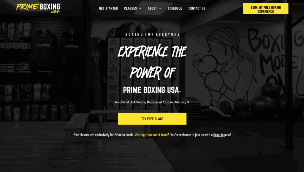
Prime Boxing USA strikes the perfect balance of minimalism, energy, and clarity. Like boxing, it’s a combination of simple, elegant, and bold. It draws you in with sharp, contrasting colors and clean navigation that helps visitors find what they need in seconds. A great gym website should be striking and effortless to use, and Prime Boxing USA nails both. The site is also mobile responsive, ensuring a seamless experience for users on any device.
The homepage features a bold image of the gym’s interior paired with a headline in a striking, unconventional font that immediately sets the tone. That same punchy style carries through the rest of the site, reinforcing a strong and consistent brand identity.
Standout details
Takeaway for gym owners
Use distinct colors and bold visuals to capture attention. Keep your site simple and direct, and always place your main conversion buttons front and center. Provide information about your gym’s facilities and services through engaging videos, and ensure your website is mobile-responsive to reach users on any device.
Why it works
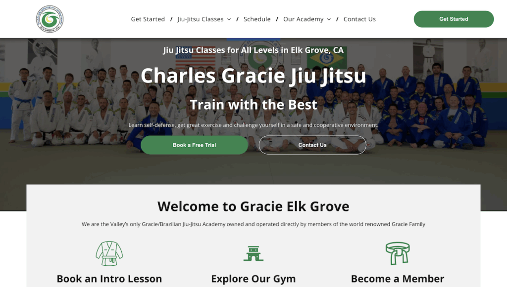
This site pairs the Charles Gracie brand credibility with the authenticity of an affiliate serving its local community. The simple structure and mobile-friendly presentation make it easy for leads and students to navigate to relevant sections.
The homepage hero section combines the messaging “Jiu Jitsu Classes for All Levels” with a photo showcasing many of their students, with a “Book a Free Trial” button prominently below. This combination of showcasing its community with “all levels” messaging puts people at their ease when deciding to try out a form of fitness that could be completely new to them and might otherwise be a bit intimidating
Standout details
Takeaway for gym owners
Spell out the steps for beginners and new customers, clearly feature age-group programs, and keep a single “Trial” or “New Customer” CTA consistent across sections of the site.
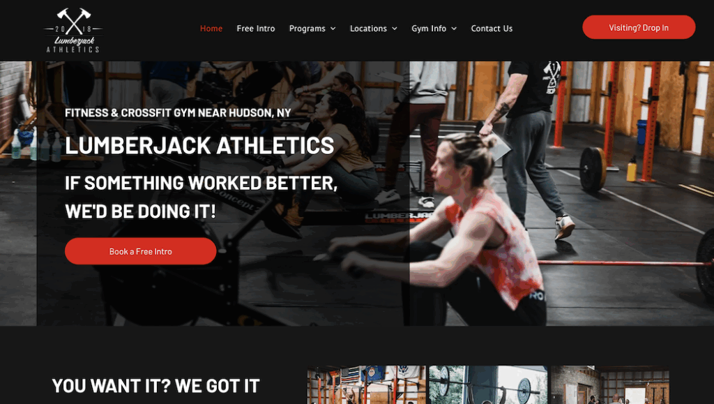
Why it works
LLumberjack’s website captures the gym’s raw-meets-modern aesthetic through bold colors, CrossFit box photography, clean typography, and copywriting that’s full of personality. The authentic, in-gym photography builds trust, while the tone is both confident and approachable. “If something worked better, we’d be doing it!”
The site’s “Book a Free Intro” call to action is repeated throughout, keeping the path to conversion short and easy for visitors.
Standout details
Takeaway for gym owners
Let your brand voice come through. Show authentic photos of your gym combined with a bold design. Repeat your most important call to action to keep choices simple.
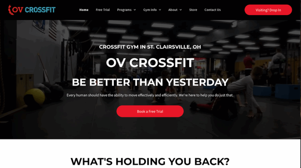
Why it works
OV CrossFit opens with a strong headline message, “Be Better Than Yesterday”, and an immediate “Book a Free Trial” call to action. The homepage also explains a simple three-step journey for joining the gym: 1) Claim Your Free Trial → 2) Go Through Onboarding → 3) Sign Up. Below it, the site features the daily class schedule right on the homepage—zero guesswork for a new CrossFitter who might otherwise be intimidated by joining a CrossFit gym.
Standout details
Takeaway for gym owners
Publish your own “How to start” journey and easy-to-review schedule on your homepage. Pair inspiration with supportive explanations, so new leads can imagine joining the gym, reducing intimidation, and increasing trial conversions.
Why it works
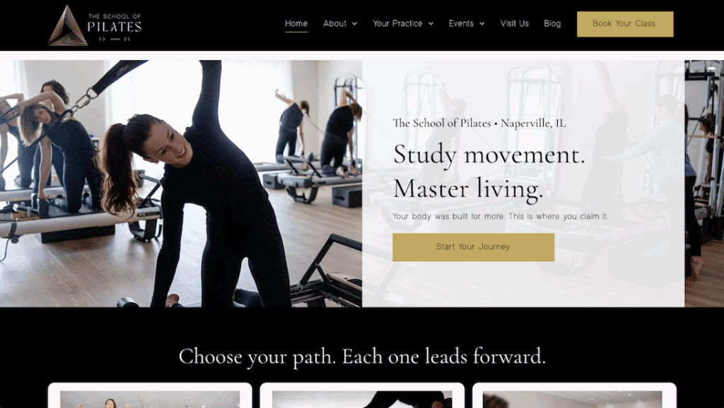
The School of Pilates webThe School of Pilates website proves that the best design doesn’t have to shout to stand out.
Its clean layout, refined color palette, and clear typography highlight specific structured programs, creating a luxurious feel that perfectly fits the brand.
The copy focuses on method and results, clearly explaining what makes Pilates special. Wellness is promoted as a core aspect of its offerings, emphasizing a holistic approach to health and fitness. Navigation and CTA buttons make it effortless for users to take the next step — “Book Your Class” or “Book Free Consult” — guiding new clients smoothly into the studio experience.
Standout details
Takeaway for gym owners
If your gym brand is premium or conveys a mindful experience, let your website’s design and typography reflect that vibe. Highlight wellness as a key part of your messaging. Keep two simple CTAs: immediate booking and a low-friction consult.
Why it works
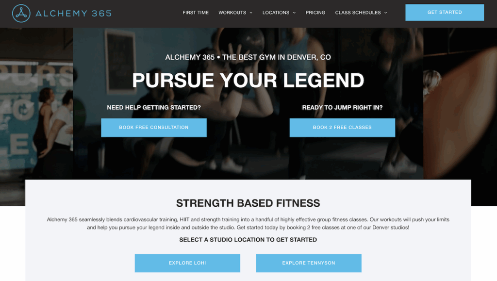
Alchemy 365’s website captures movement and momentum the moment it loads. The looping background video immediately pulls you in. Seeing real people training hard in natural light, with confident energy, shows what the brand stands for without a single line of copy.
The clean color palette — black, white, and blue — gives it an edge that feels modern and classy. Nothing on the page fights for attention; everything feels intentional. The typography is bold but clean, and the mix of motion and still photography makes the website feel alive.
Navigation is simple. The top menu—First Time, Workouts, Location, Pricing, Class Schedule, Get Started—makes it easy for visitors to find their specific need in seconds.
The clear “Book 2 Free Classes” CTA is a strong offer that removes friction for converting website visitors into leads and quickly moves new leads into Alchemy 365.
Standout details
Takeaway for gym owners
Your website can look and feel like your workouts—engaging, energetic, and easy to follow. Use video that showcases your gym’s atmosphere and combine this with a strong offer to increase lead conversion.
With the changes happening daily to Google and AI platforms like ChatGPT, you can’t afford to ignore your gym’s website.
It’s getting harder every day for small businesses to be seen, even if they’ve done everything “right.” I know the day-to-day life and business usually means that updating your website falls to next week, next month, and next year. I get it.
If you don’t invest in your website, it will become increasingly difficult for your gym to be seen by tomorrow’s customers. It won’t be overnight, but it’s a slow erosion of traffic as Google, Bing (and now) ChatGPT elevate your competitors when prospective customers are researching brands.
Over time, this increases your customer acquisition costs and eats into your business’s margins. And yes, I know that traffic alone doesn’t always translate into customers, but preparing your website for both people AND robots should be a top priority for small business owners, especially if you’re planning to scale a multi-location gym or fitness studio.
Every visitor has to count. Every experience has to reflect well on your brand. Your website plays a pivotal role in making your brand stand out, even before people land on it.
Your website influences consumer buying decisions ON your website as much as it does OUTSIDE your website. Google has rapidly integrated AI into its results since 2023. Your website is the vehicle that AI platforms like ChatGPT, Copilot, Perplexity, Gemini, and Claude use to learn about your brand and its services, hours of operation, contact information, and credentials.
💪 SEE ALSO: How to Create the Best Gym Website: Design and SEO Tips to Attract, Convert, and Grow Your Fitness Business
Plot twist: all of these websites were created by Wodify. Wodify Sites gives you a full-service website without the full-service price tag. It’s the perfect solution for functional fitness facilities, CrossFit gyms, bootcamp and boutique fitness studios, and Jiu-Jitsu and martial arts schools.
Wodify Sites helps gyms retain existing members by supporting ongoing engagement and communication, keeping members on their training schedule while you maintain control and security. It also enables gyms to easily promote special events and promotions, making it simple to attract new clients and keep current members engaged. This custom, search-optimized gym website builder is designed to help gyms support individuals in achieving their fitness goals through effective online engagement and interactive features.
You’ll get big results at a small price when you let us create a powerful, visually appealing, SEO-ready website optimized to convert leads.
With Wodify Sites, you get everything you need to launch your gym’s new website:
✅ A proven team that has created hundreds of websites for gyms and is backed by gym growth experts with real industry experience
✅ Custom design that fits your brand
✅ Built-in booking, CRM, and payments powered by an all-in-one gym management platform
✅ SEO setup and maintenance included
✅ Easy to update anytime and a team to help you
✅ Only $299 setup + $99/month, with flexible pricing and plans available for different stages of growth
Book a demo with Wodify to get the best gym website experts at the best price, and let’s see how we can bring your new website to life.
Creating a gym website that truly stands out requires more than just good looks. Your website must be optimized for search engines and AI platforms and provide an outstanding user experience that converts visitors into loyal members, whether you use an integrated platform or connect WordPress directly to your gym software.
Below, we break down 15 best practices into three key segments: Search Optimization, AI LLM Readiness, and User Engagement, with actionable takeaways tailored specifically for gym owners.
Takeaway: Incorporate relevant keywords throughout your headings, titles, and content to improve brand visibility and specifically the clarity that makes your brand distinct from other fitness businesses.
Takeaway: Test your site on multiple devices and prioritize mobile speed to reduce bounce rates. In a pinch, you can test how your site looks on iPhones and many other mobile devices with Chrome Dev Tools.
Takeaway: Regularly update your content to keep your site fresh and improve search engine rankings.
Takeaway: An intuitive navigation improves the understanding of how to find and prioritize pages across your website. It also keeps visitors engaged longer.
Takeaway: Claim and maintain your Google Business Profile and Bing Places listings to attract nearby new members. Ensure this information is consistently labeled on your website, both at the footer and the header, for instant accessibility.
Takeaway: Structured data improves your chances of appearing in rich search results and AI answers. Test your website with the Rich Results Test from Google.
Takeaway: Regular audits prevent outdated info from confusing AI and potential members.
Takeaway: Showcase your gym’s atmosphere and community. Share the background about your brand and expertise, and upload to YouTube and any other business video platforms.
Takeaway: Tailor content to answer common questions clearly and succinctly. Provide real FAQs commonly asked in person, in the terms and phrases people use.
Takeaway: Align your messaging with user intent to improve AI relevance and conversions.
Takeaway: Simplify the process with clear CTAs like “Book a Free Intro” prominently displayed.
Takeaway: Regularly update your social proof to reflect your active, satisfied community. In addition, include credentials, certificates, and other forms of validation that industry groups or competitions mention you or your business.
Takeaway: Use consistent menus and prominent links to reduce frustration and drop-offs.
Takeaway: Authentic visuals resonate more than stock images and help visitors envision themselves at your gym.
Takeaway: Data-driven improvements ensure your website evolves with your members’ needs and market trends. Verify your website content is accurate and provides a great user experience at least monthly, updating as needed as soon as you can.
By implementing these 15 best practices across search optimization, AI readiness, and user engagement, gym owners can create websites that not only attract new members but also retain existing ones, building a thriving fitness community online and offline.
Norem ipsum dolor sit amet, consectetur adipiscing elit. Etiam eu turpis molestie, dictum est a, mattis tellus.
Already know which provider you want to select?
Click “Sign up Now” to lock in your choice and pick your start date. It’s quick and easy!
Looking for a bit more information or guidance? Click “Talk to Us” to arrange a call with us. We’ll help you find the perfect program tailored to your needs.
Norem ipsum dolor sit amet, consectetur adipiscing elit. Etiam eu turpis molestie, dictum est a, mattis tellus.
Norem ipsum dolor sit amet, consectetur adipiscing elit. Etiam eu turpis molestie, dictum est a, mattis tellus. Sed dignissim, metus nec accumsan.
Norem ipsum dolor sit amet, consectetur adipiscing elit. Etiam eu turpis molestie, dictum est a, mattis tellus. Sed dignissim, metus nec accumsan.
We’ll let you try Wodify for yourself and get a feel for what it can do for your business. A Wodify rep — a real person — will walk you through every feature.

"Wodify transformed how we run the gym. I now have more time to focus on growing my business and helping members thrive."Dana Bradley, Owner of Westside Fitness
Click “Talk to Us” to arrange a call so we can discuss the flexible access options that best fit your facility.
Click “Book a Demo” to learn more about how Wodify can help your business grow.
Your branded app is one conversation away. Click “Talk to Us” and our team will walk you through everything you need to get started.
Click “Book a Demo” to learn more about how Wodify can help your business grow.